
Customize branding and themes
Change chat colors, fonts, bubble styles, logos, and avatars.
Make your survey match your brand. In Build, QuestionPunk lets you change chat colors, fonts, bubble styles, input styles, logos, and avatars. You can use a preset avatar, upload your own, or generate one with AI.
Before you start
Open the survey editor and stay in Build. Have your logo file and brand style choices ready if you want to apply them.
Customize the survey design
A walkthrough using the English interface and demo content. English audio with AI-generated narration; English and Japanese captions are available.
Download videoRead the video transcript
Open Design in Build. Choose a theme and review the text, colors, and layout. Survey settings also contains display and branding options. Check the welcome and completion screens separately. Preview on desktop and mobile. Make sure people can read the questions and use every control.
Steps
Open Design in Build
In the survey editor, open the top section switcher and stay in Build. Click Design. You will see three groups next to a live preview: Theme (system themes, your saved themes, and Generate), Brand (logo, brand color, font style, and Survey Mode), and More (colors, layout, buttons and inputs, assistant avatar, streaming and animation, and input mode).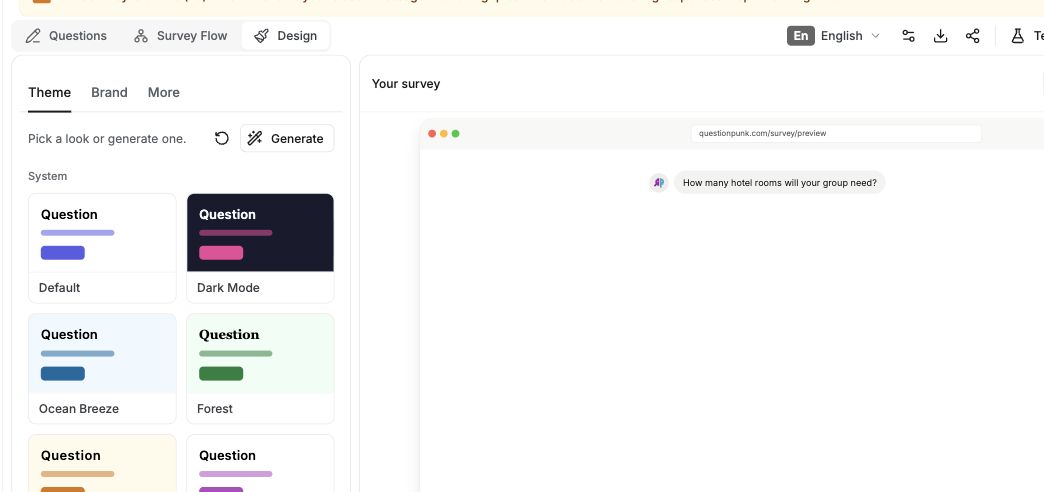
English interface · Demo study. Use the controls described in this step.
Generate a theme or choose one
Under Theme, click Generate and describe the look you want. AI will create a full design. Or pick a built-in theme for a quick start. Both options apply colors, fonts, and styles in one click.Customize colors and fonts
Set your brand color. Then set the background, bubble, and text colors. Choose a font style (system, sans-serif, serif, monospace, rounded). Pick a chat bubble style (rounded, square, minimal, modern, none). Select an input style (rounded, square, minimal, underlined, bordered). Choose a send button style (rounded, square, circle, pill, minimal).Turn Card layout on or off
Surveys run edge-to-edge by default. Turn on the Card layout switch in Design to wrap the survey in a rounded card instead. Edge-to-edge works well for embedded surveys and immersive branded flows.Set streaming and animation
Choose how AI responses appear to respondents: Raw (instant display), Word-by-word, or Letter-by-letter. Set the typing label shown while the AI is thinking. You can use the default label, custom text, or an AI-generated creative label.Add logos and avatars
Upload your company logo under Brand to show it in the survey header. Under Assistant Avatar, choose a preset (QuestionPunk, Robot, Assistant, Chat, Sparkle, Gradient) for the AI interviewer, or upload or AI-generate your own image.Customize survey screens
Edit the welcome screen and thank-you screen on their cards in the builder. Add them from Add Question > Form structure if needed. In Settings > Completion & Closed, set the redirect URL, the closed-survey message shown after the survey stops accepting responses, and, for traditional surveys, the Back, Next, and Submit button labels.Preview your branding
Use the live preview panel to check how your branding looks before you publish.
Custom branding makes your survey feel like a natural part of your brand. You can customize colors, fonts, bubble styles, input styles, logos, and streaming animations.
Use Generate to describe your brand and let AI create a cohesive theme, or pick a built-in theme for a quick start.
Chat bubble styles include rounded, square, minimal, modern, and none. Font options include system, sans-serif, serif, monospace, and rounded. Input styles include rounded, square, minimal, underlined, and bordered. Send button styles include rounded, square, circle, pill, and minimal.
The Card layout toggle controls whether the survey is rendered edge-to-edge (the default) or wrapped in a rounded card.
Control how AI responses stream to respondents: raw (instant), word-by-word, or letter-by-letter. You can also customize the typing indicator label shown while the AI composes a response.
Choose from preset avatars (QuestionPunk, Robot, Assistant, Chat, Sparkle, Gradient), or upload or AI-generate an image for the AI interviewer. You can also customize the status dot color and visibility next to the avatar.
Set the default input mode for respondents: text first (typing with optional audio) or audio first (microphone with optional typing). This is useful for AI audio interviews when you want respondents to start speaking right away.
In chat mode, the Fixed answer panel toggle keeps the input below a divider line instead of scrolling with the messages. It's off by default.
Edit the welcome and thank-you screens on their cards in the builder. In Settings, set the closed-survey message and a redirect URL for after completion, and rename the Back, Next, and Submit buttons for traditional surveys.
Pro and Enterprise plans can remove QuestionPunk branding in Settings > Display & Branding.
Check the result
The live preview should reflect your selected theme, colors, layout, logo, and avatar. If you added welcome or thank-you screens, their cards should appear in the builder.
If something goes wrong
If you cannot find Design, check the top section switcher and return to Build. Questions, Survey Flow, and Design are inside Build.